For a few years now, somewhere in December, I hold a little private ceremony in my studio. It lasts maybe 20 minutes and has no real agenda except for me to pay attention and respond to what I feel. (I’m somewhat allergic to prescribed rituals of any sort.)
I clean the space up a bit beforehand, nothing major. I settle in some special objects: flowers, candles, something aromatic for the air, a ceramic piece or two, a bit of fruit, a shot of herbal bitters.Read More >
I love a wall of books. It unfailingly rightens and reassures my weary, distracted world.
Not just anyone’s wall will do, though. I need my hand-selected wall: that mish-moshed reflection of personal passions and meaning, in which each volume has survived at least one of my annual-ish purges, if not decades of them.
While I gather new books often, I let go of plenty. Some go to the local library, some to trade at Logo’s, the local used book buyer/seller. (Where I easily spend my cash and trade-in credits on more.)
Novels and pop culture bestsellers – if I don’t request them from the library – tend to come in and go out.
My keepers? Vintage tomes, family works (yes, I’m related to more than one published author) and Art: history, artists, philosophy, creative process and technique, i.e. reference books.Read More >
The Workshop Art and Spirit led by the venerable Coeleen Kiebert, is a way to access and define one’s creative vocabulary, personal imagery, art-making process and style. Held at her stunning sea-view ceramic studio in Rio Del Mar – which also manages to be intimate and comforting – we found sharing, guidance and time for insights. While I’d taken this course in a longer format over a decade ago, it simply can’t be called a repeat; I am just not the same artist as when I first learned these methods. My goal was to arrive with as few expectations as possible, stay in the moment and tell the truth. Oh, and to circle back around to the intelligent, protective energy that Coeleen provides. What a week!
Day One: Re-steeping myself in Coeleen’s descriptive creative process and beginning again with the making of a found imagery collage on a huge 18×24 paper support. We are silent and it takes hours finding the pictures and words to select, where to place and interrelate each piece. The collage-making proved intuitive and I did not over-think it. Coeleen suggested we pause and look for evidence of the four elements in our imagery and colors. I found tons of Earth (natch), reasonable amounts of Fire and Water, but almost NO Air. When the seabreeze kept lifting my unattached piles of papers and blowing them upside down and into different arrangements, I decided that Air was playfully present and I did not need to try to represent it with imagery. I dreamt of my images that night and returned in the morning to attach the last ones before we gathered to share and respond.
Day Two: Collage completed, Coeleen introduces The Map, a conceptual grid of thirds which aids in interpreting our images by where in the rectangle they have been placed. The grid includes a continuum from unconscious to conscious, higher and lower realms, fears, undeveloped concepts, dreams, outward and inward movements, archetypal and Shadow areas. What images and colors did I repeat or put in prominent positions? What meanings can I pull from them, literal, analogic and metaphoric? These represent a language I think in: a glimpse of my image vocabulary. She suggested we pick three images and fashion them in clay, recommending that one of them be an image we don’t quite understand or are disturbed by. I started with the piano-playing hands and the seed image from the lower left, then went to the straight-forward ceramic pitcher, the vessel near the center. Side pieces appeared, but it was great to work with clay independently of needing it to have any sort of outcome: just be there and be attentive and responsive to what comes up. I could not decide on a third piece, but slept on it.
Day Three: In the morning I quickly made two clay pieces from collage imagery I did not understand. They were curvilinear and abstract, and I wound up liking both really well, even if I still didn’t quite get them.
In the late morning Coeleen guides us to The Doodle as way to access a personal style. We have a few warm-up doodles and we’re off for an uninterrupted time, moving the oil pastels silently and goal-lessly over the page however we like. And, yes, it IS touchy-feely in just the right way: a supremely visceral and kinesthetic experience for me. Outcome is not important, but I do find myself wondering what the page “needs” to express itself: Another color? Another series of marks in this corner? It was a dialogue. We hung our doodles next to our collages and began to notice similarities of colors and patterns, the division of space, the energy expressed. The collage and doodle processes are so different, and yet the results are clearly cousins!
Day Four: Time to doodle with the clay! Grab a grapefruit-sized lump of clay, work with eyes closeddoodling in 3D for at least 15-20 minutes, open your eyes and continue working. Out came this giganto spiky pod thing! What is similar here to my previous collage and doodle imagery? What has evolved? Insights? I’m beginning to think I enjoy seed pods and potential growth more than I thought I did.
Day Five: This last day is dedicated to refining the clay pieces and making one last foray into something we each wanted to understand better. I found myself making another collage. In this one I specifically was asking to understand what the concept of vessel means to me. The night before I had looked up all the meanings of the word, so I let myself find the right imagery for ships and veins and containers, even metaphoric ones as in, “He was a vessel of the Lord.” I placed the new collage next to the old one, with my doodles and clay work alongside. I find only a few connections, and only the ones I had intentionally put there; I’m spent. But the other workshop folks pointed to one similarity after another, the unity being obvious to them. And obviously I have tons more to apprehend, which I take as a Very Good Thing.
Coda: I took my wet clay pieces home, finished and fired several. The one I still don’t quite understand – the screw-like piece taken from the first collage – got a coat of black underglaze and after firing it, I covered it unevenly with thin gold leaf. The aim is to have it look more like the mysterious gold object (originally an artifact in a National Geographic.) It’s hanging on the wall a glance away, just to the upper left of my monitor, the spot on The Map where dreams reside.
– Liz Crain, who is so happy to be working this way again, she signed on for six more weeks at Coeleen’s studio starting in late October!
Yogi Berra said, “You’ve got to be very careful if you don’t know where you’re going, because you might not get there.” That sums up my early years in ceramics, both with forming the clay and most definitely with the glazing and decorating of it. Even so, when I look back, there are hints of a direction, or at least a pretty persistent search for one.
If I thought forming clay to match my ideas was difficult...(and I did; see last post.)
If I struggled with finding the best timing to shape, attach, carve or walk away from the clay….(Yes.)
If I never was quite certain if I was making it or if it was making me….(both, really.)
Well…. let me just aver, utterly, soberly and whole-heartedly: Those consternations were NOTHING, nothing at all, compared to learning how to choose and apply fireable finishes.
To my credit, I tried every method that came my way: high-fire, mid-fire, low-fire glazes. Stains, oxides, washes. Powders, pencils, chalks. Raku, pit, barrel and saggar firings. Resists, erosions, bas relief, sprigging. Colored pencils, acrylics, inks, gold leaf. Decals, china paints, lusters. Punk, Zen, Classic, Primitif.
It might be a touch purist and it certainly is a point of pride, but I believe in the completely fired surface. I’m not beyond adding “cold finishes,” but my search has always been to go as far as I’m able with the clay, the ceramic decorating materials and the heatwork of the kiln.
What follows are a selected group of forays into my early surface decorations. I purposely left out the traditional Cone 10 Reduction work because for me it has turned out to be either a default placeholder or a jumping off point for what I really found interesting: Color and the dryer surface.
Using Three Glazes to Make Plaid, 2002
Here I am getting fancy with lowfire glaze application. If you’ve done anything similar you know glazes chemically react to each other in surprising ways while melting and moving with gravity. This Three Glazes Making a Plaid was probably my most interesting semi-intentional effect. It was basically an over/under triad test tile without me knowing what that was. Yes, the blue and yellow made a sort of green, but I did not expect so much movement on the vertical surface and was lukewarm about the result. I moved on to the less-flowing colorful underglazes which were definitely more WYSIWYG.
Bright Circles with Hatchmarks 2003
This was more like it! Created during a short two-week Surface Decorating workshop, here’s a simple flattened pinch pot shape which continues the idea of primary color layerings in the previous glazed piece. It benefits from not too much movement in the underglazes AND some bold crosshatched scratches through the wet application. It’s an example of holding gold in your hands and not knowing how to follow it up with any meaningful variations. I may just have to replicate this effect now.
It’s common for academic programs to emphasize Cone 10 reduction glazes and firings and downplay working outside that format. My detailed, colorful and Cone 6 oxidation fascinations met with little support in regular classroom assignments and I did not return to them for two more years.
Copying Desert Rose (on left) 2003
But one fun thing before we continue: Once I learned that Duncan Concepts and Mayco Stroke ‘n’ Coat underglazes applied and mixed similarly to paints, I hacked my Franciscan Desert Rose china pattern. I know exactly the colors to use should I ever want to be a commercial china pattern “paintress.” May have to revisit this one as well.
Sgraffito and Painted Vase 2004
In an attempt to replicate the linearity of drawing AND the dry-brushed watercolor/colored pencil subtleties I had managed in my previous 2D work, I tried a sgraffito technique which resembled old hand-tinted woodcuts. The piece was covered with black engobe at leatherhard, then carved when it set up. After bisque firing, thin washes of non-shiny underglazes were applied. They seemed to film up the black, which I needed to restate. It got complicated, but there were vast possibilities here. It let me draw, added lovely directional textures and also let me add color without resorting to too much muddying flow or unsubtle brightness.
Isadora Series 2005
It’s good to have skills, but what to do with them? Above are four pieces related to the dancer Isadora Duncan, three of the four using the dry finish colorized sgraffito technique. These works culminate a certain era in my Backlist Story, so we’ll wind it up with them.
It was gratifying to work from the concept end of clay creating, choosing the forming and finishing techniques I’d enjoyed the most in the service of a Big Idea. They sprang from four separate semester assignments which I knit together around my theme. They were to make 1. A Hood Ornament 2. A Surprise Box – something which looked different from what it contained, 3. A Portrait of a Loved one, whether representational or symbolic and 4. A Place Setting for the Feast of Dreams, which could be a metaphor.
Here are some closer looks
Isadora Duncan Hood Ornament 2005
Based on a photo of the dancer, and modeled fairly solidly and then hollowed out and glazed with a bronze metallic glaze (who said I didn’t like shiny?), this would be a completely classical over-the-top hood ornament for my Art Car!
Surprise Over-sized Caviar Tin with Quotation Clouds 2005
Here’s a humongous (over 12″ in diameter) caviar tin replica – Isadora loved caviar! – full of sgraffito’d and painted quotations (and she was supremely quotable.)
Greek Vase Style Champagne Bottle 2005
A champagne bottle “portrait” – Isadora loved champagne! – based on drawings of the dancer, done in Greek vase red figure style. Finding just the right classic Greek vase red was a challenge! But I had a Greek fellow student who helped me with the inscriptions.
Isadora’s Scarf Mosaic 2005
A metaphoric Feast of Dreams place-setting in sgraffito mosaic, mounted and framed. It is based on a description of the six foot long -with 18″ fringe – silk batik scarf that Isadora was wearing when it wrapped around the axle of the car she was riding in and strangled her. Dramatic to the end. Let the scarf be the picnic cloth for the hereafter.
And creatively speaking, the Isadora series opened up my personal voice, in not only forming and decorating methods, but in subject matter. Ever after, the work has demanded my personal involvement in the meaning of it as well as the making. At least I know THAT much about where I’m going!
~Liz Crain, who once had an art advisor critique her work by saying, “So you can paint! What now? What will you say with it?” It was so amusingly and lovingly said, it has stuck with her as a purposeful guide.
The Art Teacher handed out a damp clay squares and baskets of buttons and said to press them in any way we liked. I remember doing this: My seven-year-old mind was trying for a certain symmetry and, as you can see, almost achieved it. I remember liking the simple pinwheel button the best (still do) and I remember writing my initials – E.A.H. – into the wet back. The finished tile re-appeared with this green glaze and I’ve had it ever since.
Fast forward to clay work decades later. Let’s look at a handful my earliest pieces and see what I remember about making them and what I see now with applied retrospective understanding.
Off-handed Soft Slab Dish with Shard, 1999
This footed soft slab textured dish shows a generous willingness to let the clay be clay, but not much finishing technique. The edges and that point are really sharp! And the piece rocks on its foot. I made four similar pieces, cutting the imprinted slabs with a sideswipe of a rubber spatula. My painter’s experience chose nearly-complementary colors for the glazes, as well as contrasting matte and shiny finishes. I see that my attraction to duller/matte surfaces appeared at the beginning, even if I felt so utterly out of control that I let the materials direct me. (Which was not so bad of a choice as it sounds!)
Free Form Vase With Legs, 2001
Another matte and soft-formed piece, done “After Instruction.” I still worked very wet, following the clay’s lead – and gravity’s – and did almost no adjusting, clean-up or finishing work, although the edges don’t bite and it sits steadily on its three legs. I enjoy the organic expanding gesture of this vase and the dull white stoneware glaze with the iron oxide “burnt” areas. Flowers look wonderful in it and it doesn’t leak. I still like to make my taller vase-like pieces dance!
Walking Winged Mug, 2001
More legs! I see this Mug/Cup beginning to have real stance and gesture. The Handle-Wing is very comfortable to hold but the crudely applied leg attachments are cracking off and that one on the far right shrunk and pulled up out of the plane of the other three legs in the heatwork of the kiln. The top rim is so uneven as to not deliver beverages to the lips without dribbling. Definitely a concept piece. Love that turquoise matte glaze which is toasty where thin! I was tiring of only glazing my work and hungry for more painterly surfaces, but hadn’t a clue on how to obtain them and was flummoxed by how radically it all changed in the kiln.
Precariously Balanced Cone Vase, 2001
A radical attempt at pushing the sculptural vessel envelope in 12″ tall concept goblet which is more about form than function and proud of it. I was still letting the clay be its lumpy self, and attaching things by glazing them together. That cone shape is barely touching the flattened support and I don’t quite know how it stayed in place. I see some poked in stippling texture at the rim and a lot of drawing with underglaze chalks and pencils before sponging on the clear glaze. A daring piece which I could have never replicated….and really didn’t want to, but I was getting away from relying on glazes at last.
Quadrupedal Zoomorph Rattlehead Prototype, 2003
A few years later, I’ve got some command of my forms….up to a point. I still work the clay when it is too wet, counting myself lucky to fashion the shapes I do before it all dries. The idea of managing and slowing my drying is still exotic to me. Notice the roughly unfinished and caving legs. By this time I’ve discovered underglazes, especially the Duncan Concepts and Mayco Stroke ‘n’ Coats which have paint-like colors, even if they are too shiny for me. Add the silver ‘cold finish’ Rub ‘n’ Buff colored wax and you’ve got “It Came From the Sea.” This was the seminal piece for a series of 20 I developed, all on legs, all with improbable animal bodies and round hollow rattle stoppers. I called them QZRs, for Quadrupedal Zoomorphic Rattleheads. They were heavy and crudely finished, but full of heart and intention and love of the medium…and they were my original invention.
What I’m taking away from these very early pieces is an appreciation for my willingness to mess around and see what happened and then make some aesthetic decisions. That investigative spirit led me to repeatedly try nearly every technique for forming and finishing I encountered, as many times as they were presented. I read avidly, clipped articles, took classes and workshops. I often heard the same instruction and explanations with new ears and a new mind, full of wonder each time. I made all kinds of errors. I learned to throw and found I was faster working by hand and that I tended to alter my thrown pieces so completely it was pointless to start with something perfectly round. I had a decided preference for sculptural over functional, narrative over reporting.
I still persisted in working the clay too wet and then letting it get away from me, though. I did not learn for at least another five years how to maintain dampness, selectively re-wet, do the right moves at the relatively optimum state of dryness, work in pieces and attach them or how to reclaim totally dried out clay. That did not really stand in my way because I was fascinated with the work at hand and there was always plenty to learn about that. Even now, the spirit of exploration accompanies me as a permanent partner in creativity.
I also see a sense of humor in these forms, a certain verve or brio that I never want to lose. It’s good to look back and intentionally catch and preserve what matters in the long arc.
Part II will expand on my early adventures in surface decorating.
~Liz Crain is a ceramic artist and has been for longer than she thought.
Last week my ceramics compatriot Karen Hansen posted about a workshop we recently attended. She titled her post “Generosity” and it was a goodie because she observed the same scenario I did in the workshop and then went on to express appreciation for how some of the artists in the audience had freely enriched her ceramics life – perhaps more than the presenter had.
I knew seven other folks in attendance that day as well. I had carpooled with three of them. On the ride home, it was clear the overall impressions we independently arrived at were similar, some kinder than others. (There was some high dudgeon hooting and hollering from the backseat.) I remember saying I got one or two new tips and felt OK in spite of the more challenging aspects to the day.
Our unquestionably fabulously skilled presenter had begun the session by issuing a few cautionary remarks about photo-taking, re-copying the handout and about online sharing of her methods. It was a bit off-putting. OK fine, I thought, she’s from a larger playing field and has had problems with this. She even mentioned something about being under contract. Respect.
But then she stinted on her whole presentation, both in time use and content. We spent most of the four hours of active demo-time watching her waver over design decisions, handbuild with wet clay (s-l-o-w) and then brush on layers and layers of underglazes, drying each one with a heat gun (s-l-o-w-e-r.) For you non-clay readers, this would be like asking cooking show viewers to watch menu-planning, ingredient assembling and the dough rise. There were a few stories and questions during these excruciating procedures, but not enough to divert us from that Waiting Around Sensation – in a chilly studio with hard chairs, to boot. In the final half hour or so, she hurriedly dug into what most of us had come to learn and ask questions about, and yet did not dish much beyond the obvious. Using stains, underglazes and carving are Ceramics 101 topics, and the techniques she shared, while skilled, are not remarkable.
One of the van riders called it stingy. Ouch!
I have to admit it was a first for me to watch a ceramics expert apply the brakes to not only how they showed their process, but to attempt to control how their audience could or could not discuss it with others later. One of the things I love dearly about the clay community the world over is the genial willingness to share special secrets and explain how-tos, knowing that those who hear and see them will:
A. Perhaps not be any further interested in working like that. Thank you very much.
B. Maybe not understand them clearly enough to do them because it’s blowing their minds.
C. Be more interested in cherry-picking and adapting those methods to their own way with clay.
Or, D. Try to replicate the style and techniques which will just never, ever come out the same.
Outright rip-offs are another kind of hacking issue entirely. But if you don’t want to risk being copied, don’t give demonstrations!
Karen quoted Austin Kleon, author of Steal Like an Artist. He encourages us to Share Like An Artist too, because everything is a mash-up.
Let me add some generosity encouragement from Seth Godin: “Do the (extra) work…The habit of doing more than is necessary…is priceless.” This means to freely give your enthusiasts more than they came for. Explain it all. Throw in the 13th donut! Tuck in a free notecard. Offer dessert on the house. (The link for Seth goes to his Free Stuff page.) The idea of giving more for good measure is so engrained in some cultures they have a word for it. My favorite is the Creole wordlagniappe: the extra lil something that sweetens everyone’s part of the deal.
Abundance. Good Will. Buzz. Leo Babauta calls it “psychitude”, the stoke from giving generously that adds meaning and warmth to our days. I would have enjoyed sharing the unique and quirky things I learned in that workshop with you, illustrated with interesting photos, but I quickly put my camera away that morning and haven’t yet looked at my notes or the handout.
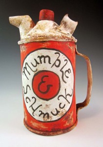
Let’s take Schmuck first. It’s not what you think. That’s Yiddish for fool, jackass, prick or worse.
In German the word means “jewels or ornamentation.” And in graphic design it relates to layout, sometimes with letters, sometimes with geometric lines and circles.
It had its heyday in the Modernist and Constructivist eras of the early 20th century, but it’s a delightful new term to me.
And, yes, schmuck is part of the etymology for the term “family jewels.”
As for Mumble, that’s my own graphic design term, as far as I know. One I developed to describe what I actually do when I am applying lettered ornamentation.
Both terms have a useful place in decorating my ceramic faux metal cans, pitchers, fillers, pails and whatever’s-to-come-from-this-creative-experiment.
Up until now, I have generally been mashing-up the layout, colors and script of old product brands onto my ceramic surfaces. It isn’t gospel copy, but rather the impressionist essence, I seek. Therefore, plenty of times I find myself “suggesting” a product’s features and benefits.
When I am “Greeking it in” – another highly technical phrase for suggesting content or layout, but not actually producing it – I am hearing in my mind the essence of what it must be saying. My brush moves along with my thoughts, mentally “selling it'”to the consumer.
At times I suspect I feel this with as much conviction as the original copywriter might have experienced; I’m just not making it readable. I’m mumbling, and it looks like Greek to all who cannot read it, but it contains real thoughts and real words. Hence: Mumble Script.
Of late, my product-defining brush is finding its own brands to sell. They might be ironic and readable, but the hyperbole-laden and intentionally unreadable body copy remains.
~Liz Crain, a writer and painter/decorator who mumbles on purpose.
This website uses cookies to enhance user experience and to analyze traffic on our website. If you continue to use this site we will assume that you are happy with it.


 Last week my ceramics compatriot Karen Hansen posted about a workshop we recently attended. She titled her post