Let’s take Schmuck first. It’s not what you think. That’s Yiddish for fool, jackass, prick or worse.
In German the word means “jewels or ornamentation.” And in graphic design it relates to layout, sometimes with letters, sometimes with geometric lines and circles.
It had its heyday in the Modernist and Constructivist eras of the early 20th century, but it’s a delightful new term to me.
And, yes, schmuck is part of the etymology for the term “family jewels.”
As for Mumble, that’s my own graphic design term, as far as I know. One I developed to describe what I actually do when I am applying lettered ornamentation.
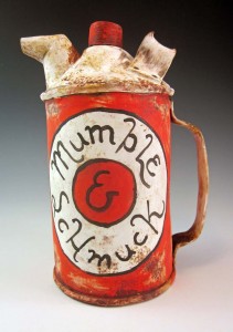
Both terms have a useful place in decorating my ceramic faux metal cans, pitchers, fillers, pails and whatever’s-to-come-from-this-creative-experiment.
Up until now, I have generally been mashing-up the layout, colors and script of old product brands onto my ceramic surfaces. It isn’t gospel copy, but rather the impressionist essence, I seek. Therefore, plenty of times I find myself “suggesting” a product’s features and benefits.
When I am “Greeking it in” – another highly technical phrase for suggesting content or layout, but not actually producing it – I am hearing in my mind the essence of what it must be saying. My brush moves along with my thoughts, mentally “selling it'”to the consumer.
At times I suspect I feel this with as much conviction as the original copywriter might have experienced; I’m just not making it readable. I’m mumbling, and it looks like Greek to all who cannot read it, but it contains real thoughts and real words. Hence: Mumble Script.
Of late, my product-defining brush is finding its own brands to sell. They might be ironic and readable, but the hyperbole-laden and intentionally unreadable body copy remains.
~Liz Crain, a writer and painter/decorator who mumbles on purpose.