Fun With “American Gothic”


Mixed media AMerican Gothic Confetti Wine Glass


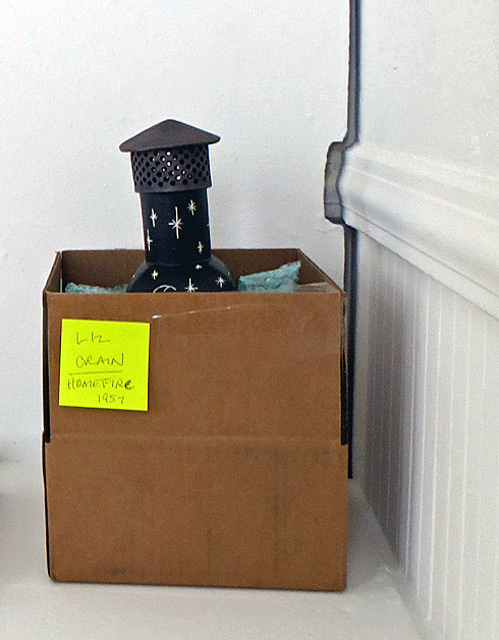
This is a “What I Did Over Summer Vacation” Report, with a focus on one work of art installed at one particular exhibit which needed weekly management every Friday for two months. The Exhibit was the second one organized by the open-ended local artist’s group called Masters of Santa Cruz.  The idea is for each artist to take the same famous work of art, make a personal interpretation of it and then show all of them together at a local winery. Last year we riffed on the Mona Lisa; this year it was Grant Wood’s “American Gothic.” What follows is a photo essay of my response to the prompt.

Turns out, it’s great fun to learn the history of a painting, study its form, content and meaning and then create a personal version.  For me, “American Gothic” wasn’t so much about those two dour salt-of-the-earth people, but rather about that Gothic arched window in the house behind them (which was Wood’s original inspiration as well), and also about what that farmer’s hand could be holding besides a pitchfork. At first I thought I would make it entirely out of clay, but then the project took its own direction toward mixed-media assemblage, emphasis on the mixed.

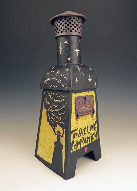
I discovered a Gothic arch-shaped shabby chic mirror and the race was on. Next I decided to sew and collage the clothing, but to leave the heads off in favor of a possible reflection of the viewer. With the right angles and distance, a person could line themselves up and take a selfie, so I titled it “Gothic Reflections.” As a point of ceramic pride, I did make the woman’s cameo brooch out of ceramic materials, adding the delicious macabre touch of a skull profile in a white decal.

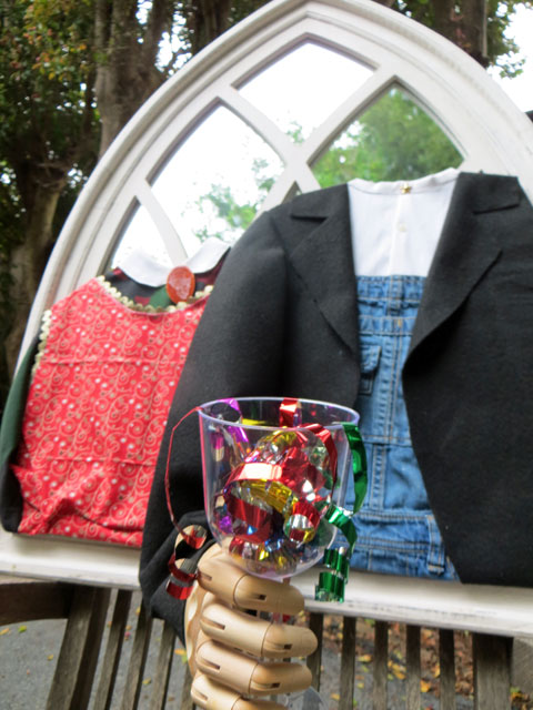
The other fascination for me was to make that clenched hand come alive, so I attached a wooden artist’s articulated hand and covered it with the felt coat’s sleeve extending off the surface of the mirror. Each week I switched out what the hand was holding, somewhat in keeping with the season. It was fun considering the unlimited possibilities and the logistics. Since the exhibit was at Stockwell Cellars, a local winery, I thought to begin and end with a wine glass. The first one – seen up top – is full of shiny plastic confetti.  Apparently I forgot to take a photo of it at the opening reception, so the first shot is of the completed piece mounted on a chair in my driveway. There still are confetti pieces out there glinting in the bushes, as they blew everywhere in the breeze.


American Gothic with Sunflower

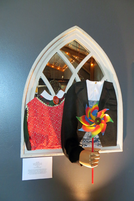
It was still early in June, but schools were beginning to let out and summer was a comin’ on. I drove across town to the winery that first Friday, a week after the opening, wondering if the wine glass had hung on as I had used only a removable museum putty to tack it in place. It had, so I was greatly encouraged that the rest of my planned weekly installations would succeed. Next one: the joy and abandonment of a pinwheel, looking a little frivolous in the hands of very sober people. Yet, as a prop, it suggested a playful wryness and I hope it encouraged some mugging from the selfie-takers.


American Gothic with Backscratcher

Third week came the backscratcher. I was imagining hammocks on Saturday afternoons and not much else. Laughin’ and scratchin’.


American Gothic with Flag and Fireworks

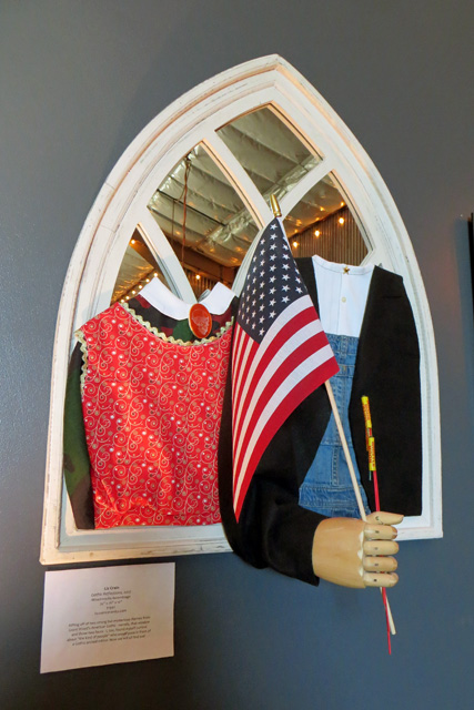
The week before the Fourth of July demanded not only a flag, but some illegal fireworks. Doing the American Freedom part up right.


American Gothic with Marshmallows

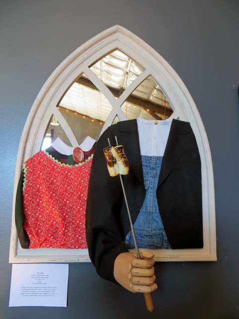
Now it’s Summer’s camping and cookout season. This installation needed some advance testing. We toasted up some real marshmallows a week beforehand and let them sit. In a day’s time they got decidedly sticky-soggy. A couple of coats of clear acrylic sealant fixed that. Yum. Yum. This was also the heaviest and most precariously leveraged piece I put in “the hand” all summer and it was a headache to install. But it also held up. Whew.


American Gothic with Flyswatter

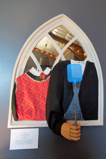
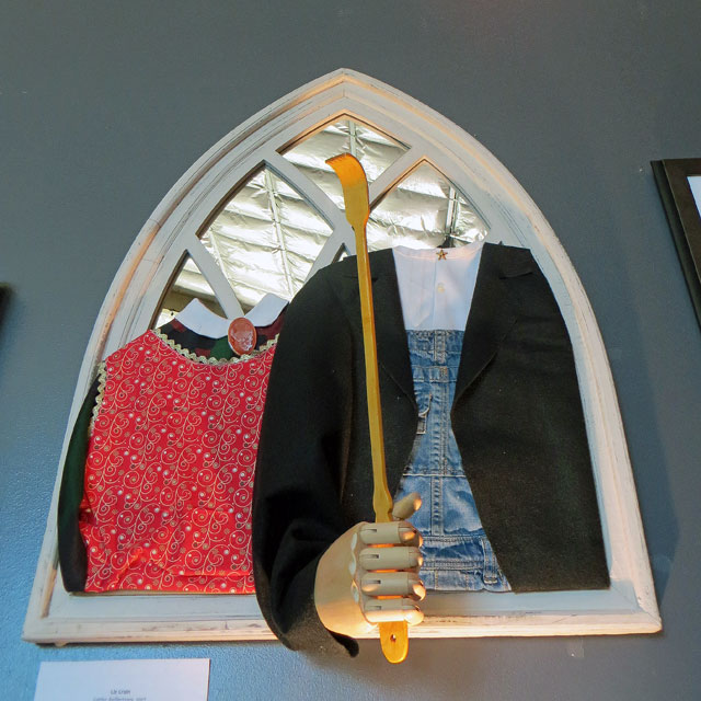
More hammock fantasies. This time swattin’ bugs. I LOVE this extendable flyswatter and use it at home all the time now. The telescoping action helped me position the piece for best balance and visibility against the dark jacket.


American Gothic with Cat o Nine Tails

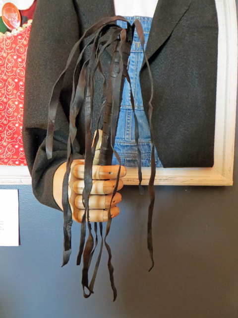
Now for some kinkiness. Hmmm. Grant Wood said he was intrigued by that Iowan farm house because of its “borrowed pretentiousness” and the “structural absurdity” of that Gothic window. He imagined what kind of people would live there and chose his sister and his dentist to pose. Once you take the types away, though,  anything is possible, especially with a cat o’ nine tails.


American Gothic with Empty Wine Glass

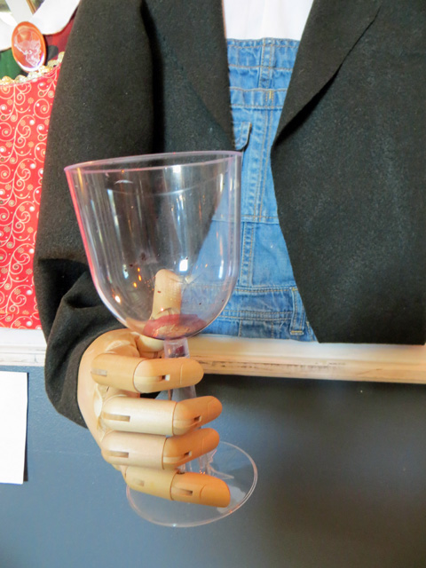
And back to the wine glass, this time empty with real dried red wine residue. The show’s over, but it certainly called up some delicious Gothic Reflections for me.

–Liz Crain, who enjoyed her Friday afternoon crosstown jaunts in beach traffic listening to KKUP’s Jewels and Binoculars Classical Show. After chatting with Jessica in the Tasting Room as she was changing out the prop, she explored the lively Westside businesses: including a gem of a yarn shop, a super bakery, a world-class coffee place, and a local natural foods store for road snacks. It’s probably a good thing it’s slightly effortful to get back over to that side of town, but it WAS a summer project to remember.

A Tasty Roomful of Monas


Four framed hi contrast ceramic tiles of Mona Lisa's face.


Mamma Mia!  Here’s a new one: What if a bunch of artists got together for a group show made up entirely of personal renditions of Leonardo Da Vinci’s Mona Lisa? All media welcome. Could be a rollick and I said, “Sì Sì.”

Read More >

I. Love. This. Mug! (And This One! And THIS One! And…)

Title Wall Great American Mug Show


A tantalizing shooting star of an exhibit titled Great American Mug Show: A Love Story opened yesterday. It’ll be up for less than two weeks, so make your plans if you’re in range.

Like a salivatin’ monkey at the Bananas Galore Shack, I had to go look, touch, desire and consume. I decided one Best Mug is an impossibility. One requires a whole wardrobe for all one’s unique drinking and vessel-acquiring needs. Here’s my fantasy collection from this show.

Read More >

R&D for Homefire 1957

Photos, clip art and articles about Sputnik 1


More fun than finishing a work of art is thinking it up. It’s a delicious brakeless state with only green lights. In the cornball can-do spirit of “Hey, let’s put on a show!” I just know my efforts will turn out swell. Probably sweller.

This gathering stage, where my Muses and Idea Wizards cavort, is a freewheeling arena for me, the born researcher. At home in my element, I track like a coonhound on a scent trail, baying at my brilliance. I love nothing better than stroking and weaving the esoteric threads of my curiosity.

I might like the Research part a little too much, though, because sooner than I often expect, the Task Warrior needs to step in as Project Manager, make some grown-up decisions and get the practical Development part going. It’s not a seamless procedure, but it’s clear that deep research leads to optimum choices which leads to swell art.

Let’s explore how this R&D cha-cha played out for my ceramic incinerator sculpture “Homefire 1957,” which I am detailing in a series of posts, of which this is the second.  (Links to the other posts in this series are below.) I ended up with a inch thick file folder of sketches, finishing notes, reference photos and typography images. The goal in gathering so much was to discover the juiciest visual and verbal inspirations, edit like crazy, and find the way to arrange them to suit the poetry of the piece.

The main research threads for this piece included:

Sputnik 1: When was it launched?  What did it look like? Why could I see it in the LA twilight with my dad? What about that October Sky movie? What was Sputnik’s impact on the world? What happened to it? What did a person look like when they were staring up and pointing at it?  Sputnikburgers, anyone?

Backyard Incinerators: While I knew some of their history from the making of that first incinerator sculpture, now I needed to make its story personal. I revisited my original files, asked my mom to reminisce with me, and poked around online to see what more has turned up in the past seven years. I learned about the first smoggy day in 1943 – they thought it was a new form of warfare – and the beginning of the fight for clean air.  But I still don’t know where all those bulky backyard buddies went when the ban was enacted.

Style and Lettering: I wanted to both blend and contrast a dramatic Soviet propaganda poster style with a Space Age graphics vibe and I needed scads of examples of both. I also wanted to write “Sputnik” in a Cyrillic alphabet, to carve “Traveling Companion” in a 50s  retro typeface, and to hand-write those Latin phrases in the swirly incinerator smoke. The stylized space stars were easy.

Colors: The Soviet poster colors won: black, red, yellow and white it was.

Techniques: I knew I wanted to do the whole form in Sgraffito Technique which involves covering the leatherhard piece with a thick coat of black underglaze, transferring designs onto the surface and carving parts of the black away to create high contrast. The rest of the colors would come after the first bisque firing. From thumbnails to final drawings, more decisions/edits were made, but by that point it was pretty clear how the whole piece would work.


Final sketches for Homefire 1957 ceramic incinerator sculpture


My late mentor, Kathryn McBride, routinely astounded students with her ability to work in clay with elegance and precision at a tiny-tiny-tiny scale. One semester, during her routine slideshow of her work, she heard the gasps of astonishment and said sweetly, “Yes, I have always enjoyed working quite small and detailed and I have quit apologizing for it!” As for me, I’m not routinely astounding anyone but myself, for the most part, but I will own up to the fact that digging deeply into a constellation of subjects and creating a synthesis from them is one of my juiciest joys. And I have quit apologizing for it.

Liz Crain — who has never really been good at keeping a sketchbook, even though “everyone” says to. Perhaps she will start.


Series Links

“Homefire 1957” Series


“HOME” Exhibit Series


Exhibit Details: “HOME” Member’s Exhibit 2016, July 6 – August 7, Opening Reception July 10th 2-4PM,  Pajaro Valley Arts Gallery, 37 Sudden St., Watsonville, CA


Between Two Fires

ceramic incinerator sculpture

“All art is autobiographical. The pearl is the oyster’s autobiography.” 

–Federico Fellini

So, there’s this: A ceramic incinerator sculpture that I ended up calling “Homefire 1957.” Other than perhaps a bomb shelter sculpture to exorcise my childhood’s deep fear of being annihilated in a nuclear war, nothing else quite portrays what was happening in my domestic and cosmic home at that time more than this piece. Yeah, it’s autobiographical.

Read More >

The Guestbook Problem – Solved!

NewMailingList


Actually, Guestbook, is the wrong name for it. To me Guestbook implies a memory book with poignant comments left by a clutch of visitors. Historical. Reception-y. Funereal.

And, if a simple listing of visitors and their comments is not the main goal, how to make sure the thing does what it’s supposed to do? I think I know!

Read More >