More fun than finishing a work of art is thinking it up. It’s a delicious brakeless state with only green lights. In the cornball can-do spirit of “Hey, let’s put on a show!” I just know my efforts will turn out swell. Probably sweller.
This gathering stage, where my Muses and Idea Wizards cavort, is a freewheeling arena for me, the born researcher. At home in my element, I track like a coonhound on a scent trail, baying at my brilliance. I love nothing better than stroking and weaving the esoteric threads of my curiosity.
I might like the Research part a little too much, though, because sooner than I often expect, the Task Warrior needs to step in as Project Manager, make some grown-up decisions and get the practical Development part going. It’s not a seamless procedure, but it’s clear that deep research leads to optimum choices which leads to swell art.
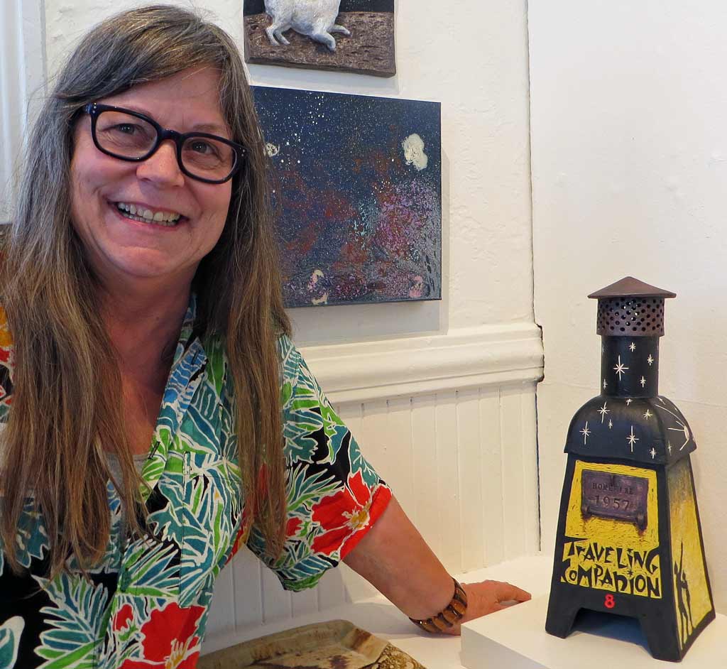
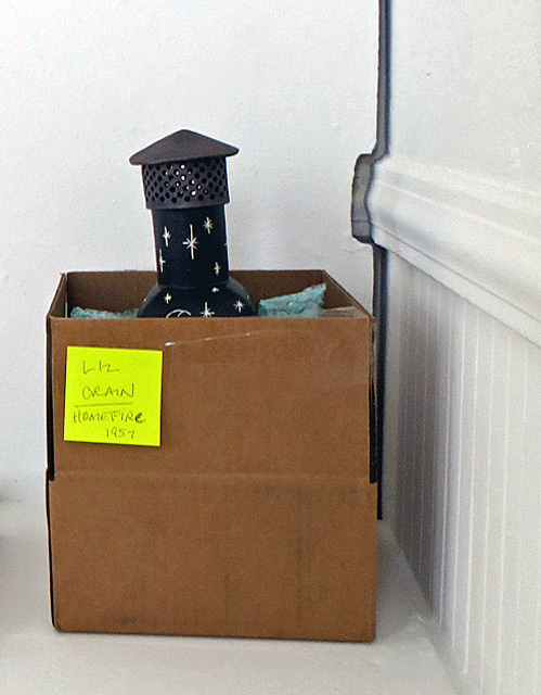
Let’s explore how this R&D cha-cha played out for my ceramic incinerator sculpture “Homefire 1957,” which I am detailing in a series of posts, of which this is the second. (Links to the other posts in this series are below.) I ended up with a inch thick file folder of sketches, finishing notes, reference photos and typography images. The goal in gathering so much was to discover the juiciest visual and verbal inspirations, edit like crazy, and find the way to arrange them to suit the poetry of the piece.
The main research threads for this piece included:
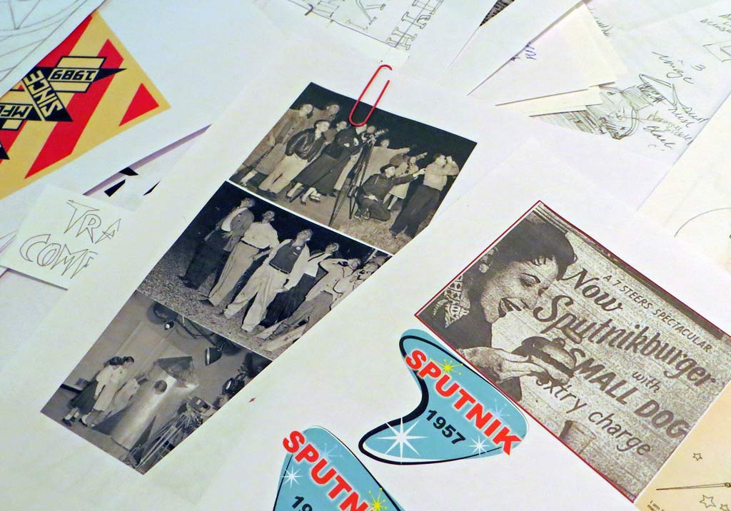
Sputnik 1: When was it launched? What did it look like? Why could I see it in the LA twilight with my dad? What about that October Sky movie? What was Sputnik’s impact on the world? What happened to it? What did a person look like when they were staring up and pointing at it? Sputnikburgers, anyone?
Backyard Incinerators: While I knew some of their history from the making of that first incinerator sculpture, now I needed to make its story personal. I revisited my original files, asked my mom to reminisce with me, and poked around online to see what more has turned up in the past seven years. I learned about the first smoggy day in 1943 – they thought it was a new form of warfare – and the beginning of the fight for clean air. But I still don’t know where all those bulky backyard buddies went when the ban was enacted.
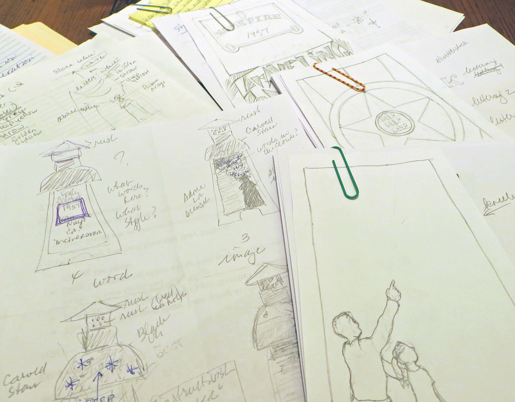
Style and Lettering: I wanted to both blend and contrast a dramatic Soviet propaganda poster style with a Space Age graphics vibe and I needed scads of examples of both. I also wanted to write “Sputnik” in a Cyrillic alphabet, to carve “Traveling Companion” in a 50s retro typeface, and to hand-write those Latin phrases in the swirly incinerator smoke. The stylized space stars were easy.
Colors: The Soviet poster colors won: black, red, yellow and white it was.
Techniques: I knew I wanted to do the whole form in Sgraffito Technique which involves covering the leatherhard piece with a thick coat of black underglaze, transferring designs onto the surface and carving parts of the black away to create high contrast. The rest of the colors would come after the first bisque firing. From thumbnails to final drawings, more decisions/edits were made, but by that point it was pretty clear how the whole piece would work.
My late mentor, Kathryn McBride, routinely astounded students with her ability to work in clay with elegance and precision at a tiny-tiny-tiny scale. One semester, during her routine slideshow of her work, she heard the gasps of astonishment and said sweetly, “Yes, I have always enjoyed working quite small and detailed and I have quit apologizing for it!” As for me, I’m not routinely astounding anyone but myself, for the most part, but I will own up to the fact that digging deeply into a constellation of subjects and creating a synthesis from them is one of my juiciest joys. And I have quit apologizing for it.
Liz Crain — who has never really been good at keeping a sketchbook, even though “everyone” says to. Perhaps she will start.
Series Links
“Homefire 1957” Series
“HOME” Exhibit Series
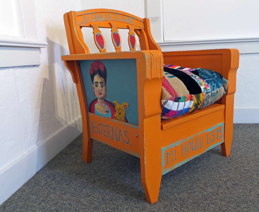
Exhibit Details: “HOME” Member’s Exhibit 2016, July 6 – August 7, Opening Reception July 10th 2-4PM, Pajaro Valley Arts Gallery, 37 Sudden St., Watsonville, CA