Mumble and Schmuck


MumbleandSchmuck_ GO115_2013


Let’s take Schmuck first. It’s not what you think. That’s Yiddish for fool, jackass, prick or worse.

In German the word means “jewels or ornamentation.”  And in graphic design it relates to layout, sometimes with letters, sometimes with geometric lines and circles.

It had its heyday in the  Modernist and Constructivist eras of the early 20th century, but it’s a delightful new term to me.

And, yes, schmuck is part of the etymology for the term “family jewels.”

As for Mumble, that’s my own graphic design term, as far as I know. One I developed to describe what I actually do when I am applying lettered ornamentation.

Both terms have a useful place in decorating my ceramic faux metal cans, pitchers, fillers, pails and whatever’s-to-come-from-this-creative-experiment.

Up until now, I have generally been mashing-up the layout, colors and script of old product brands onto my ceramic surfaces. It isn’t gospel copy, but rather the impressionist essence, I seek. Therefore, plenty of times I find myself “suggesting” a product’s features and benefits.

When I am “Greeking it in” – another highly technical phrase for suggesting content or layout, but not actually producing it – I am hearing in my mind the essence of what it must be saying. My brush moves along with my thoughts, mentally “selling it'”to the consumer.

At times I suspect I feel this with as much conviction as the original copywriter might have experienced; I’m just not making it readable. I’m mumbling, and it looks like Greek to all who cannot read it, but it contains real thoughts and real words. Hence: Mumble Script.

Of late, my product-defining brush is finding its own brands to sell. They might be ironic and readable,  but the hyperbole-laden and intentionally unreadable body copy remains.

~Liz Crain, a writer and painter/decorator who mumbles on purpose.


Share this:

You’re Better With Better Tools, Maybe.

I just spent a small fortune on some clay carving tools. They are stainless steel, nicely shaped, and noticeably weighty, so maybe their price per pound compared to garden variety aluminum/wood tools is the same, or even cheaper. I don’t know. I don’t care.

Sexy-Expensive-Designer tools are a relatively new thing in the clay world – new as in this millennium, really –  because clay is such a primal activity and often just as easily managed with your hands and maybe a stick and a shell. I have a couple of older books devoted to the ancient practice of making your own brushes and tools. I’ve done this.  I think as a group, clay folks are pretty opportunistic and will have fun making a tool out of pert near any ol’ thang.

OK,  now I’m getting silly. Yet I do mean to contrast the down and often dirty home-grown self-sufficiencies of much ceramic work – especially functional pottery –  with an ever-growing arena of High Artistry featuring the precious piece – now considered sculptural – on a well-lit pedestal in a hushed gallery. Could this paradigm-shift extend to the tools as well?

As usual, I sit somewhere in between and am not above cutting an expired plastic card into a shape I need to texture my clay. Yet  I am equally amenable to paying $30 for four sassy-orange, very nicely engineered and name-branded cutting tools.

And why is that? To my mind, tactility rules, not aesthetics. How does it feel? Does the extra heft improve my performance? Do the insanely precise loop shapes cause me to take more care when I make a cut? Do I clean these tools more often because I respect not only their excellence but their cost? Maybe that’s all true, and yet…

Am I buying mystique? What or who is the maker/seller Xiem?  I know it’s a clay center/gallery in Pasadena where a few years back I was rejected for a show by the mythic Paulus Berensohn. I figure he gazed upon the slides – yes, slides! – of my pathetically unevolved work for a few seconds, and then sent the loveliest personally hand-written rejection email an artist is ever likely to receive. Other than that, Xiem has a certain panache and stretches like a heirloom sunflower towards a stylistic sensibility I’m not quite sure I fully share,  having one foot as I do on the opposite bank of that crik,  being a homemade tool-maker and all.

Am I buying Xiem’s tools because I’m a sorry-ass toady wannabe?  Nope. At least I’m sure of that! I bought these tools because they felt right in my hands.  I hoisted their remarkable heft, noticed the eight cutting shapes and their sharp beveled ribbon edges and knew I held excellence. Excellence I could extend into my work. These babies are just gonna HUG the road!

I have a lot of tools, but like my first Cabrillo SummerArts instructor, Una Mjurka, I return to the ones that do their jobs simply and well. Una had reduced her tools to mainly an all-purpose wooden stick and a favorite brush. She’s good like that. I’m almost there. It’s a practice, sort of a ceramics studio version of the Zero Waste Home. I have my personal stick and brush, and I know purpose and supreme function wherever I encounter it. Why bother with gizmos?

So the Better Tools Search comes with a caveat: what’s better for you? What do you need to make? What will facilitate that?  What do you need to jettison? Will this new tool facilitate your crafting more than any tool you already possess? How will you justify the cost,  of either your time spent making it, or your cash spent buying it? I can both recommend and un-recommend these Orange Beauties. Depends on what you want. But if you ever get to test-drive one, do it!

~Liz Crain, a ceramic artist who  – up til now –  swore her Amaco T-9 Sgraffito Tool was the supreme instrument.

Share this:

Facing the Faces: The Reality of Real Art, Real People


There’s a creative pause in ceramic art-making I call “The Bisque Freeze,” and I’d had a nearly two year case of it after beginning the portrait sculpture pictured above. Any manner of hesitancies can feed The Freeze, but they all are sourced from the fear of farking up your precious work with your rotten and unsure decorating choices once you’ve gotten it safely through that first bisque firing.


This piece was not only the biggest thing I’d made to date, she was both fearsome and delicate. Here’s a side-view showing the thin porous ponytail in the back. Lots could go wrong, but it can with any piece. With this it would just go wrong in a bigger way. I spent those paused years making other things and occasionally wondering how and when I would get back to the baby elephant in the clay studio.

While I had learned the Big Head construction methods in a two-week summer workshop with the energetic, affable and very clear instructor, Stan Welsh, he understandably did not cover finishing techniques, as the works needed at least a month to dry afterwards. Two summers later, under the surefooted guidance of the energetic, affable and very clear instructor, Tiffany Schmierer, I learned the underglaze wash and dry-brush methods that matched what I’d had in mind for the piece all along. Or more to the point, I learned about being bold and fearless once again in the face of The Bisque Freeze.


Two related asides before I continue this saga.

First, a lot of my ceramic faces are caricature portraits. To me that means that something about the very real countenance of a very real person catches me up and I find myself portraying that response in a face jug (a la my Local Talker jugs) or a portrait bust. Usually I work from a photo and only have the one view, but that’s enough and I am free to interpret the other attributes. Sometimes I go Classical Greek style and emphasize the ideal, but mostly I go Roman Republic realism,  showing the gritty detail to reveal the unique character.

In that summer workshop with Stan I made two big heads, one a rather repulsive stuffed-cheeks hot dog contest eating champ, nearly ready to spew. The other, this compelling wistful anorexic woman,  proudly sitting for her formal portrait because she was getting healthier. I don’t recall noticing the name or other info with the photo I found back then, just this: “She’s in recovery and gaining weight.” It’s the reason I could bear to explore her pained, skeletal features, because she was hopeful and proudly representin’!

Second,  when I finally felt I could approach adding color to this Major Work, I stood it on a wooden table outside, hosed it off well, let it dry in the sun and covered it with thin washes of color, happily building up the surface information and modulating areas for values, tones and interest, deep in relationship with the persona.  I was lost to my work, unaware of the handyman who’d been around a few days helping to dig a trench for new gas and drainage lines down the whole side of our house.  Later that evening my hubby reported that after seeing my piece and watching me work,  he had exclaimed with a bit of incredulousness, “Geez, when you told me your wife was an artist, I didn’t think you meant a real one!”

I’ve chuckled over that unvarnished Emperor-has-no-clothes honesty ever after; without question the finest validation out there. It’s about being deeply, undeniably real in all ways possible, even when real is still a completely squidgy interpretation. Me. The Subject. The Art. The Viewer. Real as real can be. So real, even the handyman acknowledges it.

Even though I’ve drifted away from making faces and figures for the time being, I still heartily enjoy them. Recently I’ve rekindled the dialogues with my portrait work as I gathered my collection of Ugly Jugs, Skull Jugs, Character Face Jugs, Local Talkers and Portrait Busts in order to display them from now until the end of April, 2013 at the Scotts Valley Library in an Art at the Library group exhibit entitled – of course – “About Face.”

As part of the renewed conversations with these pieces, I wondered if after 5+ years I could re-locate the source photo for “She’s in Recovery” and went googling around. It’s all so much easier now and I not only found it many times over, I learned her name, I learned her fate.  Her name was Kate Chilver and she lost her 19-year battle with anorexia at the age of 31 in 2011.

~Liz Crain, who is profoundly glad she made this portrait bust of Kate Chilver, who’s name and struggle are fondly and respectfully acknowledged.


Share this:

Love the Slab You’re With, Part Two


You’ve got a batch of wet colorful, marble-y, strata-fied  slabs now,  as a result of trying the underglaze decorating methods outlined in the previous thickly illustrated post, which is naturally titled LTSYW, Part One. What oh what can you do with them?

I have a hunch we have all  just begun to see what. For that reason, I plan to relate the paltry few things I’ve done and noticed when I tried, and leave it at that. There really aren’t any appropriate Do This and Then That instructions from here on out, because the technique is wide open to expression and experimentation.  I’ll throw down a few dots, but you get to connect them any way you discover. Lana Wilson – the source of this technique for me –  says the same in her handouts: “Play.” “Experiment.” “Play. Play. Play.” I, too, learned by playing and wish that fun for you!


Before I leave my dotted breadcrumb trail,  let’s take up what I think Lana is getting at when she calls herself “The Queen of Low Standards.” First, it infuses a workshop atmosphere with relaxation, fun and the gifts of imperfection. She says it more than once in the course of several hours, for tension-releasing laughs, for instant forgiveness when a demo goes awry, for purposely scrambling off the pedestal of know-it-all ceramic expert which some might have placed her on. Yet Lana is clearly conversant in the technicalities and artistry of her field. Her fingers move deftly and with intelligence. She’s as comfortable presenting a full day of hows and whys and stories to match as she is forgetting the specific word for a glaze fault. And if the audience can’t supply it, she pops it out sometime later. A clear pro at work.


There is no Fourth Wall with Lana, though; you’re in the soup with her.  Pretzel logic. Crazy Wisdom. Magnetic PERMISSION. She actually handed out strips of paper with the word “Permission” on them and invited us to write down what we wanted permission to do or think or try. And voila!, we had the Permission Slip for it. The Queen is benevolent! But about those Low Standards? My guess is that keeping the way into the work accessible unlocks the largest amount of joyful possibilities and provides access for the diverse pantheon of Muses, not just those of Ultimate and Objective Perfection (if they even exist beyond our timidity!) Once we’ve allowed ourselves to play in that way, THEN we can begin to sharpen our skills, get technical, learn from our mistakes, become conversant with how this method works for us.

Back to those slabs!  Here are some things I’ve learned about them when I played around.

Good to Know:

There are all kinds of ways to amend  your patterns while the clay is still flat.

You can add more color if you like, probably not too wetly.

You could stamp light textures, carve lines, or roll thin scraps on top to emphasize areas.

You could even carve out “worms,” turn them over,  switch them around (on both sides!) (Lana’s fun idea; she calls them fossils.)

Rolling your added textures and additions smoothe is a good idea. It sets the designs and creates a unified surface.

There is range of optimum workability when the clay still bends without cracking: pretty darn wet to “mozzarella” hard.

Thinner rolling = more stretching/fading/abrading of colors.

Patterns or templates for your planned creations might be a good idea. Lana used a tile cutter with an ejector!

It’s good to work rather deftly – ala Lana, with a light-handed clarity of purpose. What do you like to do with slabs? Try it!

Simple joins, overlapped or beveled, pressed and perhaps lightly paddled are good. Add water before attaching, if you’re so moved, but that’s it.

You might need to support your creations’ seams and walls until they set up.

Excess handling, too much water or tooling, fussy appendages: all impact the still-damp patterned underglaze and can smear, erase and create an overworked feel.

You can paint bare cut edges, say at the top of a cylinder, with a line of underglaze to complement your marbling. Lana showed us black edges which are snappy.

Alternatively, make some very thin strips and create a rolled edge. Attach with water, press well.

Dry slowly, bisque slowly, just ’cause.

You can amend with more color and washes after bisque, when the first colors are set.

Clear glaze, especially a transparent matte, looks great.

I’ve also used colored pencils, Pitt ink pens and clear acrylic satin medium to seal non-functional and purely decorative work.

All your remaining wet clay scraps have interesting new possibilities too.

Enjoy this process and make fun stuff! Happy New!


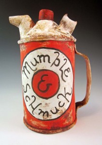
~Liz Crain, who’s found a jazzy new way to play with clay –  and since her word for 2013 is “Synthesis” is excited to see what comes about when she incorporates it into the vintage faux metal work she’s done for several years now.


Share this: